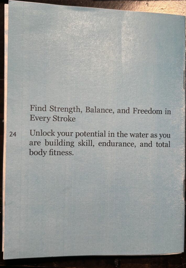
The booklet example that I created was named Complete Guide to Swimming Book and is about learning how to swim for beginners. Swimming is more than a sport. Swimming is a type of exercise for others to get in better shape. Also, it explains about the precautions for swimming in the pool safely.
Watercolor Brochure
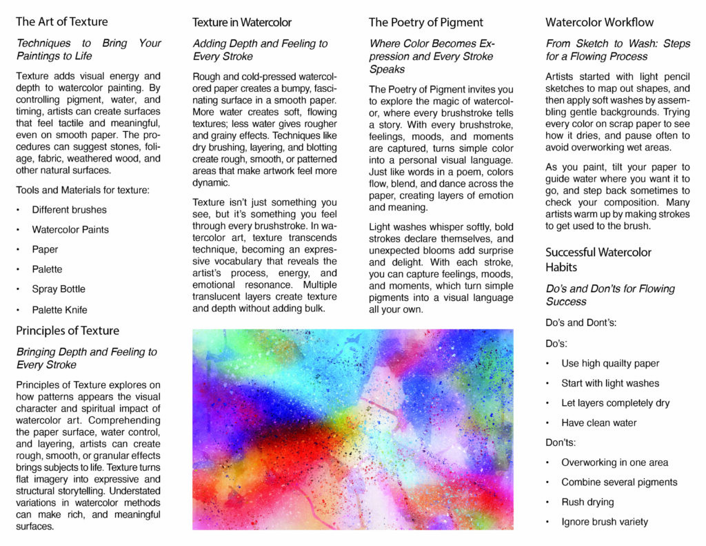
The brochure explains the basics of watercolor painting—how texture, pigment, and water interact to create expressive art. It covers tools, techniques like layering and dry brushing, how color flows and blends, and the importance of paper, brushes, and drying time. It also gives simple dos and don’ts for achieving smooth washes and avoiding common mistakes. Overall, it teaches how watercolor’s transparency and texture bring paintings to life.
The Travel Times Newspaper
Travel Times Newspaper was published in October 2025. The Travel Times highlights U.S. travel destinations and seasonal tips. It features hidden gems like Shasta Lake, Minneapolis, Pollock Pines, and San Diego, describing their landscapes, activities, and local culture. Another article covers the intense summer heat of 2025 across the country. The issue also includes travel advice, a short poem about the featured cities, and guidance for exploring each destination during the current season.
Mental Health Project
Developed my final project in Illustrator class. The image is an illustrated portrait of Rosalynn Carter, stylized with layered, painterly shapes. Her name curves above her head in bold red text, while additional hands around the portrait appear to gesture or point toward her. Beneath the portrait, more red text reads “FIRST U.S. LADY,” and a caption below highlights her advocacy for the Mental Health Systems Act of 1980, noting that the U.S. Congress passed it.
Wheel Assignment
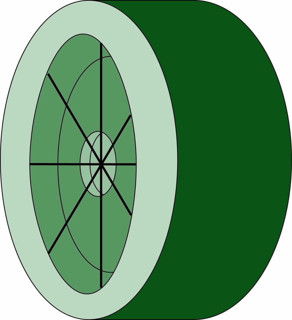
The image shows a stylized drawing of a wheel- or turbine-like object. The left face is visible as a circular shape containing multiple radial spokes and concentric rings, resembling a cross-section of a wheel, fan, or mechanical rotor. The outer ring is a light green color, the inner circular sections are dark green, and the body of the wheel extends to the right as a dark green cylindrical form.
Logos Assignment
I created a set of paired logos, each shown twice horizontally at the beginning of the Illustrator class in spring 2025. They appear to be well-known brand symbols placed in matching pairs.
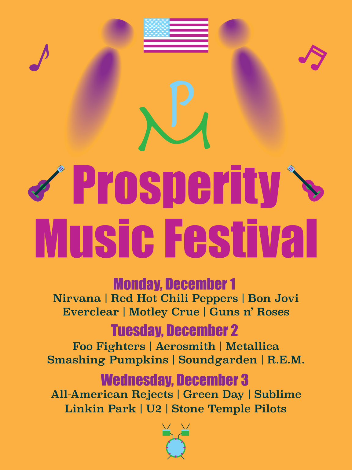
Prosperity Music Senior Project
Prosperity Music Senior Project is an American music festival band that occurs annually in the last year of the month. The brochure of the map is significant; however, others need it to find places around the festival. I created my music festival using the colored logo, the black and white logo, and the knockout logo. I also developed wristbands, tickets, and maps using Adobe Illustrator.
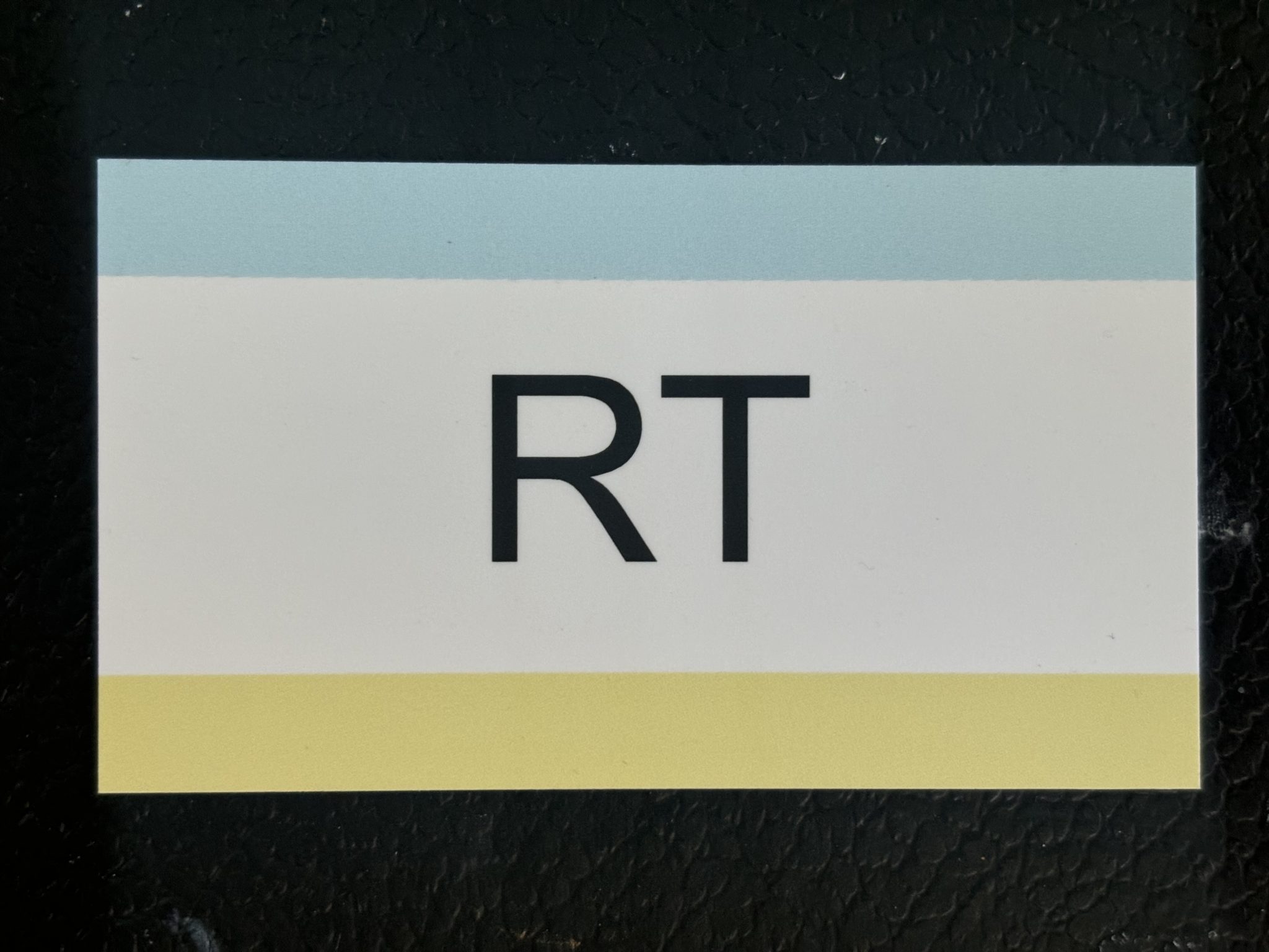
Since the information on my business card is essential, I’ve included it in the project. My business card’s logo is crucial since it identifies who made the initials on the front.
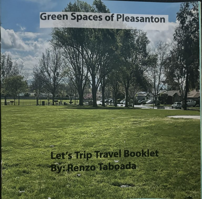
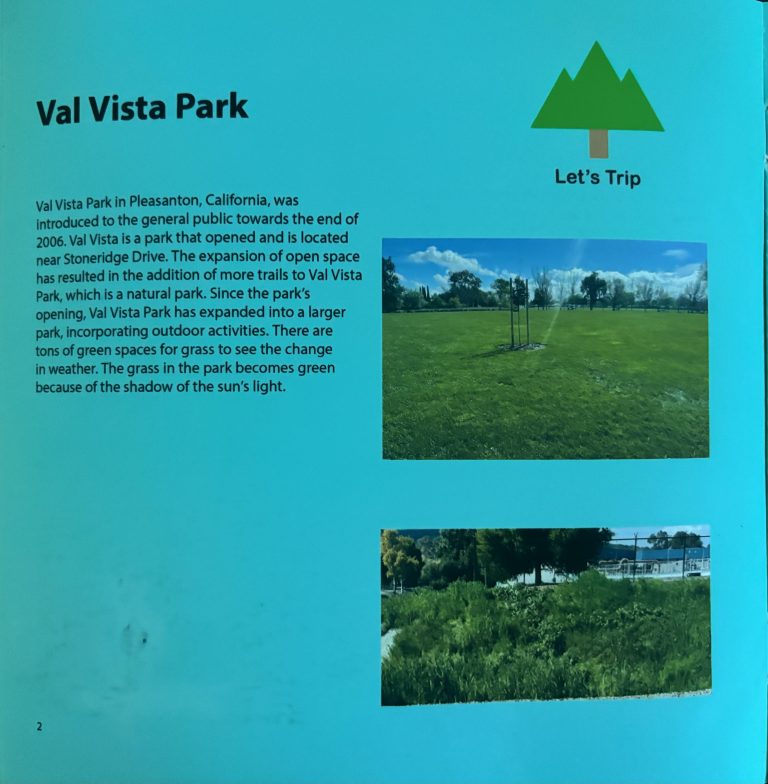
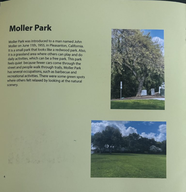
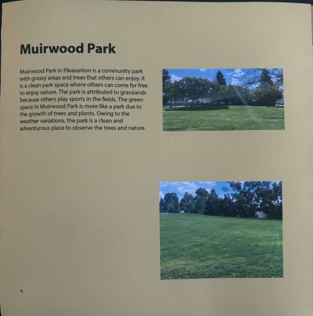
The green space booklet stated the facts about the parks in Pleasanton. I wrote about the three parks and provided the park’s information. I made the project easy to read in the booklet by using bright colors.
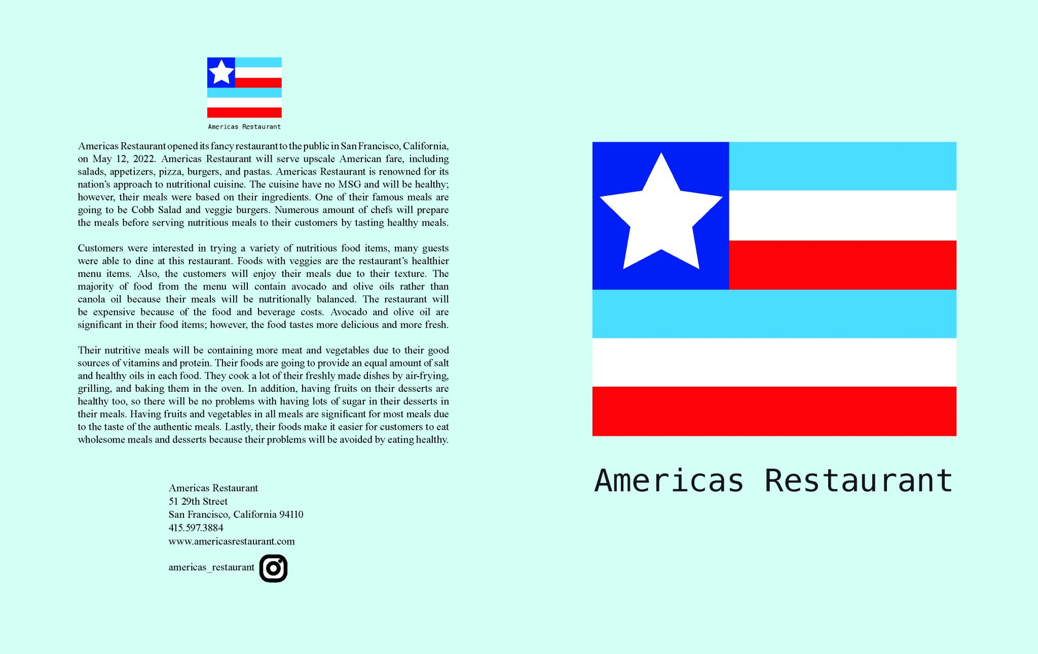
I created the menu based on the food options on my menu. According to the menu, America’s Restaurant will offer American cuisine. America’s Restaurant is famous nationwide for its focus on healthy food. The chef created the meals using healthy ingredients and without MSG. Also, the food categories on the menu have different prices of food.
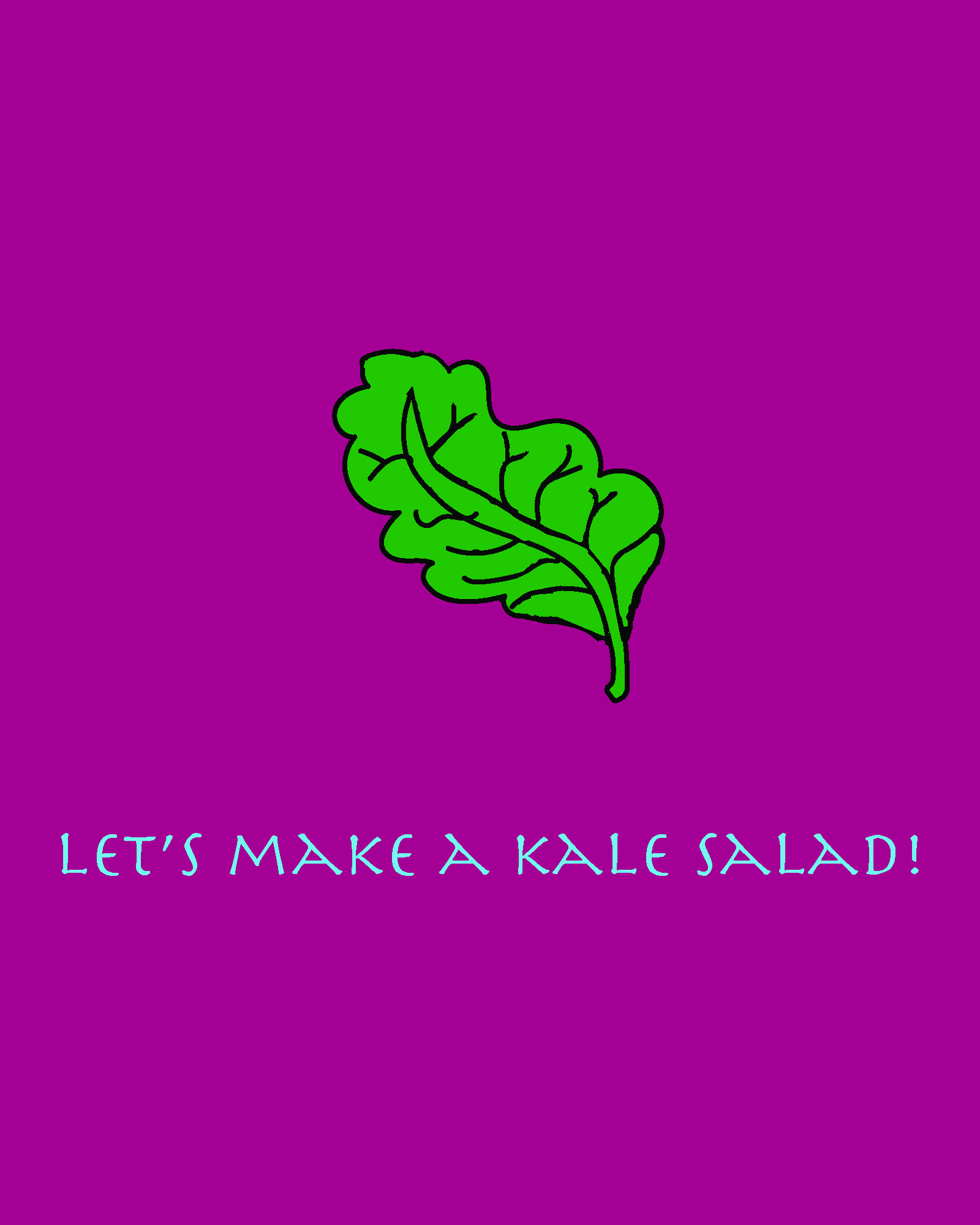
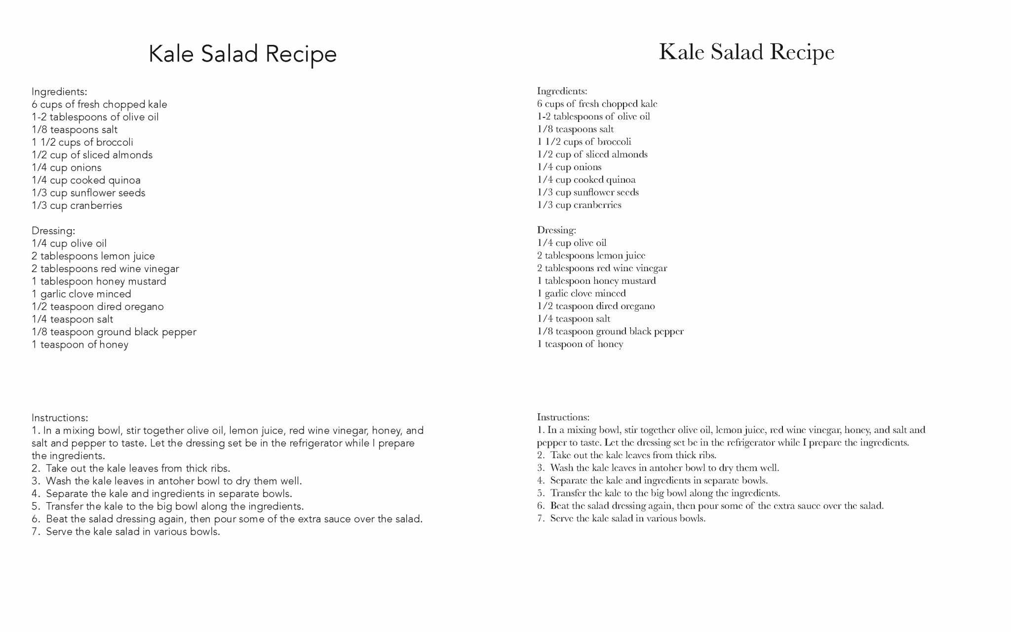
I created the Typography Cookbook Project assignment in April 2023. I used Illustrator and different color palettes to develop my logo for my kale salad. Eight different typefaces illustrate the importance of typography in the cookbook. The project book cover made it clear that I could only use dark and vivid colors.
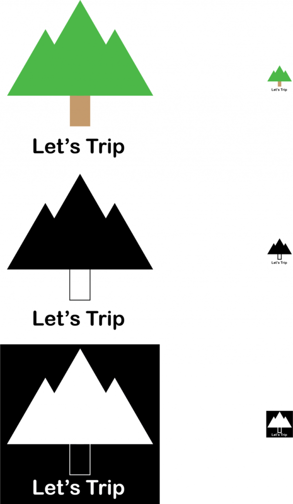
I used the knockout logo, colorful and black and white, to create my logo designs for the green space project. I decided to make a green tree because of nature’s color. The brown color symbolizes earthiness and connection to the living world. The Arial typeface captivated me because of how well its color displays the font and the logo.
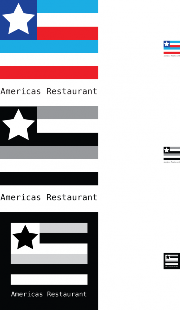
I made my logo designs using colored, black, and white, and the knockout logo in my menu designs. This flag explains the theme of the restaurant because of the colored logos. I chose red, white, blue, and turquoise, so it stated why the American flag is crucial to my theme. The dark blue square features an illustrated star.
I took some pictures of the different letters from different places. My specimen chart shows black and white because of its contrast. I wrote a paragraph or two about the font from my specimen chart. The chart explains why the font is crucial to my theme. The poster size of my chart is 11×17 inches because the teacher decided to print it bigger.
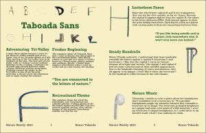
For my editorial spread project, I decided to create the first 12 letters in my font. It indicated why the letters of the font were significant to my nature theme. The editorial project that I created in class has a blue title font and an explanation about nature. I created the editorial spread in my last week of typography class.
I preferred to do the chocolate mousse project in my Design and Concepts class. My teacher showed me how to make the packaging box. I designed my packaging boxes by using different colors and the same logo. I intended to explain the purpose of the chocolate mousse packing and how to make it by the end of the semester.